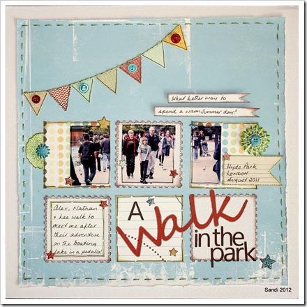
How could I resist a challenge using a sketch based on a LO by the lovely Sian?
Sian’s example LO’s & those of the other members of the Scrap 365 Design Team where all so varied & there was much inspiration to be had!
I don’t usually use photo’s as small as 2 1/4” square & it stumped me for a while! Then I thought of using a landscape 9x13cm photo cut into sections to cover more than one block! Job done! I like this picture because Lee & the boys are oblivious to me taking it! I was sitting in the lakeside cafe playing with my then new zoom lens, waiting for them to return from their time out on the boating lake!! It’s not perfect…but the day was!!


9 comments:
Love it, Sandi - great idea to use a 'divided' photo :)
It's beautiful Sandi! Thank you so much for making this one your own with that divided photo. A genius idea like that makes me want to go and start my page all over again :)
Love it Sandi.....great idea to cut up the photo...also love how you've done the title.
Love this! And I also really appreciate your movie review post and story from Sunday, too!
Rinda
Totally fabulous, the use of the landscape shot and the title placement are awesome :)
Love the layout, well done
What a fabulous way to do the photo's, it works really well. Thank you for taking part:)
Beautiful page! Love how you used the sketch putting the title over two blocks. Great colours too. TFS!
Great page and lovely colour scheme! The page is so fresh!
Post a Comment